
More Tales in Bad Restaurant UX
Series: tangential July 22, 2013
I’ve been trying to hold back my rants on restaurant UX after I went a little crazy on the new Freestyle Coke machines (I still hate them with a burning passion), but my beloved McAllister’s Deli has really made a big blunder.
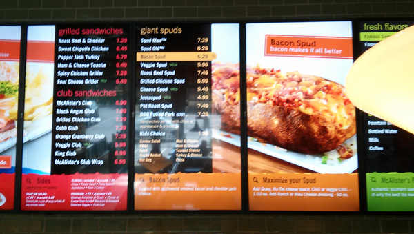
I go to McAllister’s Deli every Monday for Indy Startup Lab, rain or shine. Recently, they switched all of their menus to digital, displaying the items on ten large vertical monitors.
Visually, they are pretty neat; lots of big pictures of the food and an attractive color scheme.
But they are absolutely terrible to use!
One of the most important pieces of information for a menu to display is the ingredients or toppings on an item.
I know what a Club Sandwich usually has on it, but is there bacon? Is there mayonnaise? Is there mustard? What kind of bread? What’s the difference between the King Club and the McAllister’s Club?!?
This information is relegated to the very bottom of each column on the new menu boards. And worse, it only displays the details for whichever item is “active”. The screens cycle through the list of sandwiches like a carousel, only revealing what the heck is on the Spud Óle if you happen to glance over at the right time.
The menu items cycle at a 10 second interval so I get to wait nearly 2 minutes to see what comes on my sandwich if I miss it the first time around. Okay, I could ask at the counter but what is the point of listing it all?
The whole menu board is designed like it’s a application or
something. It would work great with a mouse :hover or if I could
tap the menu item to select it — but this isn’t an app! It’s a
32” monitor mounted to the ceiling!
The font size scales based on how many items are in each category so you have the desserts at 24px and the sandwiches at a squint-worthy 13px right next to each other. You literally cannot read the list of sides (a choice that every single customer has to make!) until you are at the register. Ugh.
Look, I get it McAllister’s CEO — you are trying to modernize and make it easier to swap in new menu items. But I can’t imagine how this passed through any kind of user testing. At the end of the day, every minute spent explaining what is on a sandwich slows down the process for everyone. Go to McAllister’s during the lunch rush and you will find a line wrapped around the restaurant so speed does matter.
My recommendation: the old menu boards worked great, why don’t you just digitize them instead of rolling out this frustrating carousel of sadness?
[Addendum, 08/05/2013]: Overheard some McAllister’s employees talking about the downsides of the new system. They agreed that the boards were very pretty, but that they had been receiving four times as many questions about items when ordering. Also, if the computer system powering the menu has problems, it takes 30 minutes for them to reboot.