
Responsive Layouts in Android without Copy/Paste
Series: android December 11, 2013
I’m working on an Android app that targets both phones and tablets so I’ve been digging into how to build layouts that work across all device sizes.
I have some experience with responsive design on the web — things like fluid grids, media queries, etc — so I wanted to try to leverage those same approaches for Android.
My biggest goal was to create a layout that can scale up without having completely separate layouts for each screen size. Android uses configuration qualifiers to load up the right resources based on your screen size or orientation (portrait or landscape).
Instead of tweaking individual layouts per device, I’ve found that it is much
easier to just overload a styles.xml file for changes between sizes.
If you think of it like CSS, you will have your base styles in the
values/styles.xml file and then define media query-like customizations in
values-sw600dp/styles.xml (7” tablets), values-sw600dp-land/styles.xml
(7” tablets in landscape), values-sw720dp/styles.xml (10” tablets), etc.
In a typical CSS responsive grid system you might have a .container class
that is 960px wide (with auto-margins) on desktop screens. On a phone, you would
make the .container have 100% width (with no margins).
We can take the same approach using Android styles. First, setup a base style.
res/values/styles.xml
<style name="Container">
    <item name="android:layout_margin">0dp</item>
    <item name="android:padding">16dp</item>
    <item name="android:layout_width">match_parent</item>
    <item name="android:layout_height">match_parent</item>
    <item name="android:orientation">vertical</item>
    <item name="android:background">@drawable/container_background</item>
</style>
For tablets in portrait orientation, we add a bit more padding since the screen is larger.
res/values-sw600dp/styles.xml
<style name="Container">
    <item name="android:layout_margin">0dp</item>
    <item name="android:padding">32dp</item>
    <item name="android:layout_width">match_parent</item>
    <item name="android:layout_height">match_parent</item>
    <item name="android:orientation">vertical</item>
    <item name="android:background">@drawable/container_background</item>
</style>
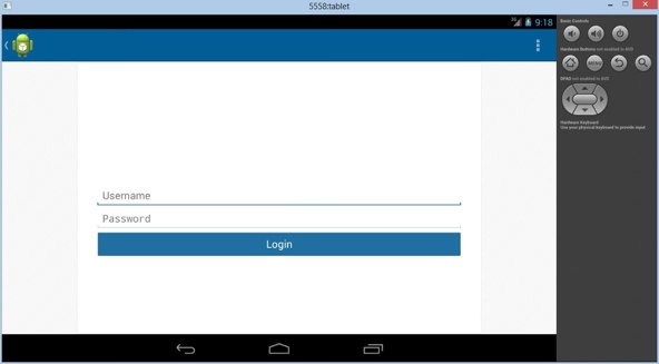
The big change is on tablets in landscape orientation. We add layout margins so that the content doesn’t stretch the full width of the screen. We can add a different background drawable to the parent view (like a subtle pattern) to fill the whitespace.
res/values-sw600dp-land/styles.xml
<style name="Container">
    <item name="android:layout_marginRight">130dp</item>
    <item name="android:layout_marginLeft">130dp</item>
    <item name="android:padding">32dp</item>
    <item name="android:layout_width">match_parent</item>
    <item name="android:layout_height">match_parent</item>
    <item name="android:orientation">vertical</item>
    <item name="android:background">@drawable/container_background</item>
</style>
Then on our various application screens, we use our style like so:
<LinearLayout style="@style/Container">
  ... buttons, edit texts, text views, etc ...
</LinearLayout>
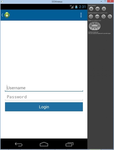
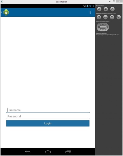
A single application layout for all screens that scales up (and down) gracefully.
4” Phone
7” Tablet
7” Tablet (Landscape)
Another handy feature of some CSS frameworks (like Bootstrap) are the helper
classes like .visible-phone, .hidden-phone, .visible-tablet, etc. We
can do the same with Android.
<!-- Device Visibility -->
<style name="PhoneOnly">
    <item name="android:visibility">gone</item>
</style>

<style name="TabletOnly">
    <item name="android:visibility">visible</item>
</style>

<style name="TabletPortraitOnly">
    <item name="android:visibility">gone</item>
</style>

<style name="TabletLandscapeOnly">
    <item name="android:visibility">visible</item>
</style>
Drop these styles in each of your configuration folders and toggle the visibilities on and off as appropriate.
<LinearLayout android:id="@+id/column_one">
  ... some content ...
</LinearLayout>

<LinearLayout android:id="@+id/column_two"
  style="@style/TabletLandscapeOnly">
  ... some extra content since we have space ...
</LinearLayout>
For a tablet in landscape, the style will cause the second column to be shown. For all other devices, the second column will be hidden.
With just a few lines of XML, we have a mini-framework setup that can be used throughout our app. You can extend this technique to implement other common “classes” (think master-detail or cards) as needed.
Unfortunately, it is tricky to distribute a JAR that contains Android resources (outside of Gradle) so there hasn’t been much progress made in creating the Bootstrap-equivalent for Android (don’t be confused by either of these projects, they don’t do what you might expect). Hopefully, Android’s move to Gradle will make a reusable layout framework more feasible.